Introduction:
In the vibrant tapestry of fashion, color coordination is an art form that can elevate personal style from ordinary to extraordinary. The way we combine and harmonize colors in our outfits speaks volumes about our aesthetic sensibilities and fashion prowess. This essay serves as a comprehensive style guide, delving into the principles of color coordination and offering insights into mastering this art to create visually appealing and harmonious ensembles.

Understanding the Color Wheel:
To master color coordination, one must first understand the basics of the color wheel. The color wheel is a circular arrangement of colors based on their chromatic relationship. It consists of primary colors (red, blue, and yellow), secondary colors (green, orange, and purple), and tertiary colors, formed by mixing primary and secondary colors. Complementary colors sit opposite each other on the wheel, creating high contrast, while analogous colors are adjacent, offering a harmonious blend.

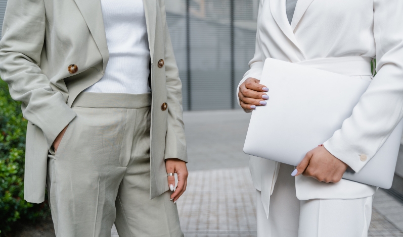
- Monochromatic Harmony: Monochromatic color coordination involves using variations of a single color. This creates a clean, sophisticated look with a streamlined visual appeal. Different shades and tones of the same color family can be combined to achieve depth and interest without introducing other hues. Monochromatic outfits are timeless and effortlessly elegant.
- Complementary Contrast: Complementary colors, found opposite each other on the color wheel, create a dynamic and high-contrast look. Combining, for example, red and green or blue and orange, adds vibrancy and energy to an outfit. When using complementary colors, it’s crucial to balance the intensity to avoid overwhelming the eye. One dominant color can be complemented with smaller accents of its complementary counterpart.
- Analogous Elegance: Analogous colors, located next to each other on the color wheel, offer a subtle and harmonious blend. Combining colors like blue, blue-green, and green or yellow, yellow-orange, and orange creates a cohesive and sophisticated look. Analogous color schemes are pleasing to the eye and lend themselves well to a range of styles, from casual to formal.
- Triadic Balance: Triadic color coordination involves selecting three equidistant colors on the color wheel. This creates a balanced and visually appealing ensemble. Examples of triadic combinations include red, blue, and yellow or purple, orange, and green. When using triadic colors, it’s essential to balance the intensity and distribution of each hue to avoid overwhelming the overall look.
- Split-Complementary Harmony: The split-complementary scheme is a variation of the complementary color coordination. Instead of using the color opposite on the wheel, it involves selecting two adjacent colors to the complementary hue. This softens the contrast while maintaining a visually interesting combination. For instance, pairing red with blue-green and yellow-green offers a more subdued and balanced look.
- Tetradic Richness: Tetradic, or double-complementary, coordination involves using four colors together, in the form of two complementary color pairs. This scheme offers a rich and diverse color palette, allowing for a wide range of creative expression. Achieving balance is crucial, and it often works well to have one dominant color while using the others as accents.

Practical Tips for Color Coordination:
- Consider the Occasion: The appropriateness of color coordination depends on the occasion. Vibrant and contrasting colors may be suitable for casual outings, while subdued and harmonious hues are more fitting for formal or professional settings. Understanding the context ensures that your color choices align with the overall vibe.
- Understand Your Undertones: Personal color analysis, considering your skin undertones, can guide color choices that enhance your natural features. Warm undertones pair well with earthy tones, while cool undertones complement jewel tones. Understanding your undertones helps you select colors that flatter and illuminate your complexion.
- Experiment with Patterns: Incorporating patterns into your outfits adds complexity and visual interest. When combining patterns, ensure they share at least one common color to maintain cohesion. Stripes, florals, and geometric patterns can coexist harmoniously if chosen thoughtfully.
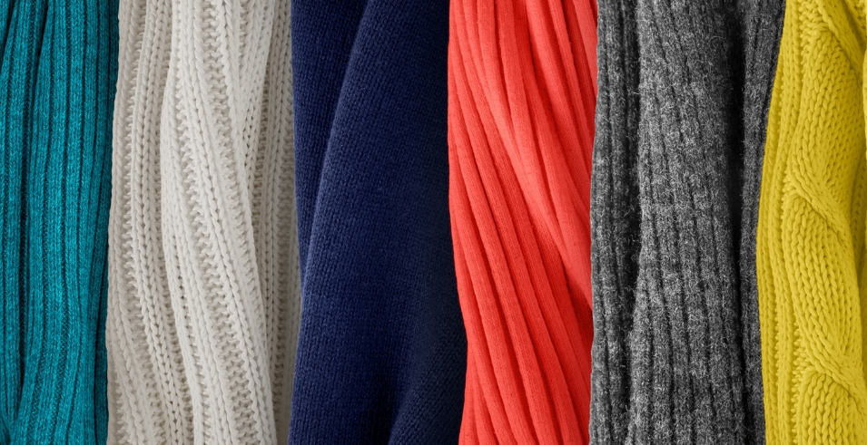
- Neutral Foundations: Neutral colors (black, white, gray, beige, and navy) act as versatile foundations in color coordination. They pair well with almost any color on the wheel and provide a balance to bolder hues. Neutral pieces, such as a classic black blazer or white sneakers, offer a timeless and sophisticated touch to any ensemble.
- Accessorize Strategically: Accessories are powerful tools in color coordination. A statement handbag, a vibrant scarf, or bold jewelry can introduce pops of color without overwhelming the entire outfit. Accessories allow for experimentation and provide opportunities to inject personality into your style.
- Balance Intensity: Pay attention to the intensity and saturation of colors in your outfit. Balancing bold, vibrant colors with more subdued or neutral tones prevents visual overload. For instance, pairing a bright red blouse with neutral bottoms creates a balanced and visually pleasing look.
- Trust Your Instincts: While color theory provides valuable guidelines, personal style is ultimately a subjective expression. Trust your instincts and experiment with combinations that resonate with your taste and personality. Fashion is an ever-evolving art, and the joy of style is in the exploration and discovery of what works for you.

Conclusion:
Mastering the art of color coordination is a journey of self-expression and creative exploration within the world of fashion. Understanding the principles of the color wheel, experimenting with different schemes, and considering practical tips empower individuals to curate visually appealing and harmonious outfits. Whether embracing the simplicity of monochromatic elegance, the energy of complementary contrast, or the subtlety of analogous harmony, the art of color coordination allows for endless possibilities in personal style. As individuals paint their fashion canvases with a rich palette of hues, they embark on a visual journey that celebrates the beauty and diversity of personal expression through the language of color.